Alison McElroy
Alison McElroy
Alison McElroy
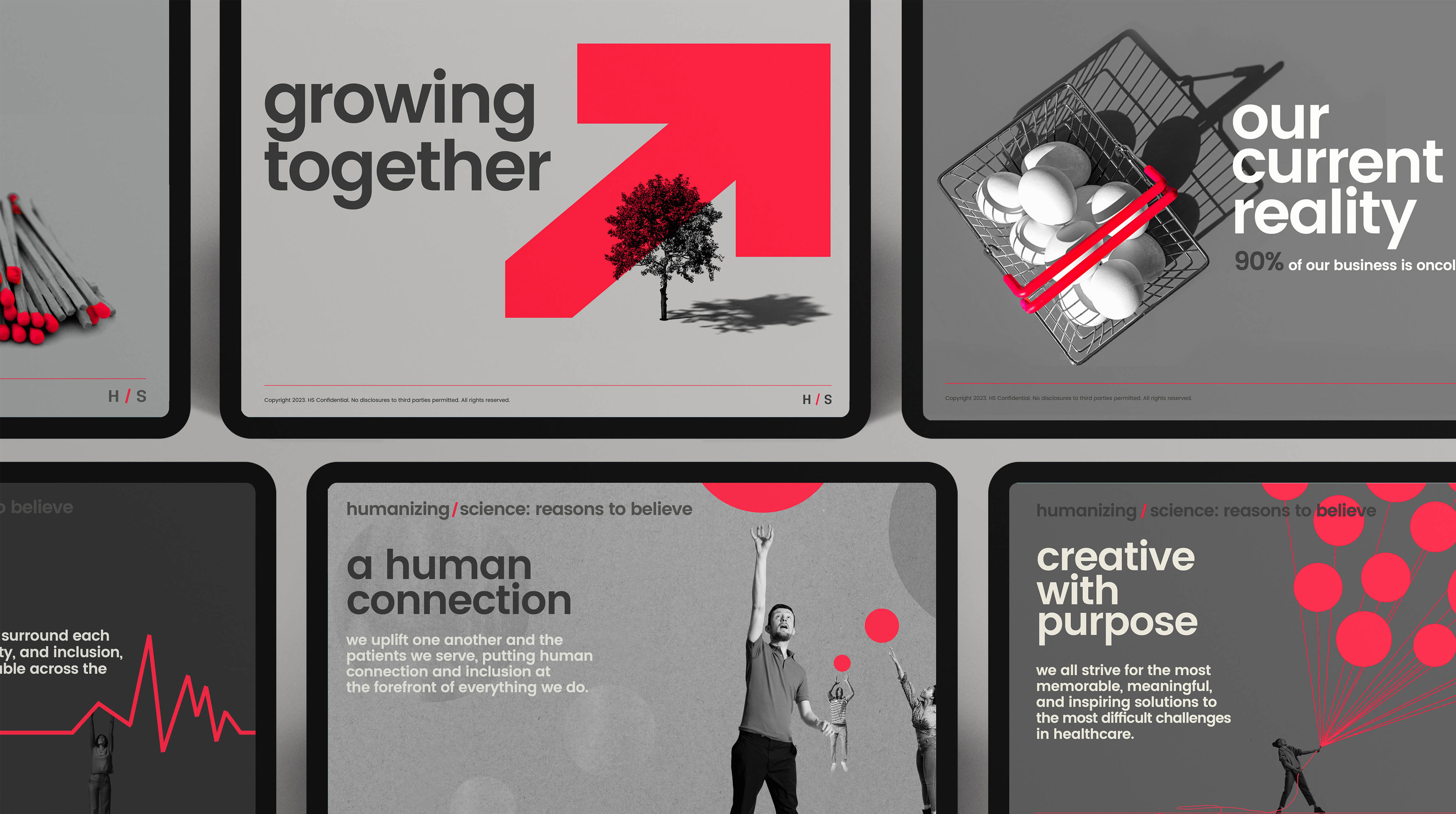
For this global healthcare marketing agency, I executed a refined brand refresh that modernized the logo while preserving its equity. By subtly shifting the reds and greys, I created a vibrant “color vibration” that added energy and pop, giving the identity a cleaner, more contemporary presence without sacrificing recognition.